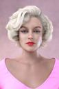
AOBB's Sweetheart (and v2)head morph for G8.1F inspired by Marilyn Monroe. No materials or textures.
Hi guys,
I really tried to make a good likeness of Marilyn Monroe but couldn't get her right. Still, I thought I would give you this head morph - Sweetheart - that came out of my efforts. As it is based on a real person, even if just loosely, then noncommercial use only. Here she is:

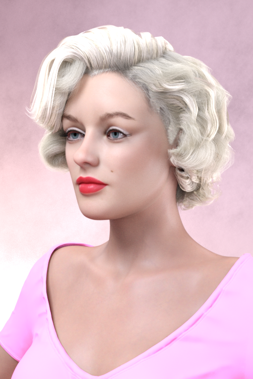

Assets used in the promo images:
Portia 2 hair for Genesis and G2
Ingrid hair for G8F
Beautiful Brows II for G8F and G8.1F (Brow1)
Victoria 7 for G3F face texture 05 modified (lips removed, whitish eyeshadow added, eyeliner lines extented, white waterline added)
Rain HD for G8.1F PBR skin material
MSO Mina for G8F lip material
Natural Eyes II for G8.1F and G8.1 M
dForce Heidi Outfit for G8F and G8.1F
Lashes Utilities for G2,3 and 8
Please enjoy and if you make a render with this head morph, please post it in this thread!  I love to see your work!
EDIT:
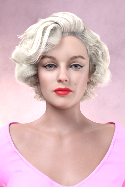
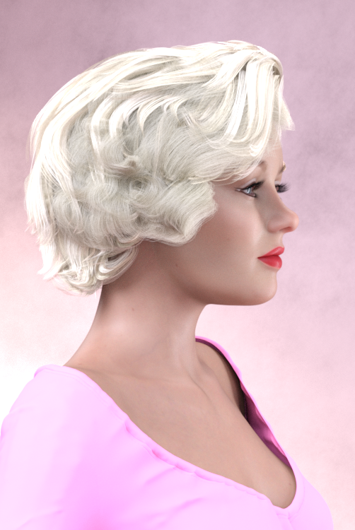
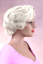
Today, while looking at the images above I realized how this head morph could be further improved. I thought before that I gave it all I've got but I was wrong! So here is the improved likeness of Marilyn Monroe - Sweetheart v2:
Enjoy even more!
AOBB


Daz 3D is part of 
Connect
DAZ Productions, Inc.
224 S 200 W, Suite #250
Salt Lake City, UT 84101
Licensing Agreement | Terms of Service | Privacy Policy | EULA
© 2024 Daz Productions Inc. All Rights Reserved.
Comments
I have posted Sweetheart rendered in a classic pinup pose here:
https://www.daz3d.com/gallery/user/6420504982323200?edit=album#gallery=album401753&page=1&image=1229722
Have fun!
AOBB
It looks incredible... downloading now!!! Thank you!
You're welcome, perlk!
That looks really great AOBB! Well done on the resemblance and all the attention to detail in your renders, getting her hair and makeup and posing just so. Lovely work!
Two DAZ thumbs up!
 She looks really good.
Close, and still very nice!
OMG! Thank you all so much! I'm so happy you like her.. Thank you also for your support!
AOBB
Awesome! Thanks :)
@DigiDotz - you are welcome!
Hello AOBB,
Heres's a work in progress:
Based on this photo:
What do you think about it ?
__
Improved ...
_
Mark, this is awesome! Wonderful job! Thank you so much for sharing. It's a real treat to see those images!

great render
Mark_OREZ_4815 Fabulous render!!
AOBB: Thank you very much for your comment and you're welcome ;) I'm really happy to read your opinion and positive feedback from, the creatress. I'm going to work a bit more on this image and hope it's going to be realisticaly and and artisticaly better.
nonesuch00: Thank you for your comment. Always happy to read a comment/opinion.
SapphireBlue: Thank you for your comment. I definitaly love your Daz gallery. Special greetings for the "AOBB's G8.1 Face Morphs" section ;)
Looking forward to seeing the finished product, Mark!

Today's update
I really like the colors in this render, Mark. Not sure about the hair (especially Mitchum's which looks too much like a wig) I also preferred Mitchum's expression better in the previous renders. I am not trying to put down your work, I hope you understand, but just help you make it better by giving you honest feedback. I think you have something good going on there, so I'm giving you a bit of a push in (what I believe) is the right direction... Happy rendering!
Hello AOBB, thank you for your comment I really appreciate your opinion and advice. And feel free to put your opinion, no problem to me
Hair:
Indeed, didnt found hair to match perfectly the reference. At least this one as a much more circular path on the top and reflections.
Also we see less of the forehead.
It could be better with less hair volume, slightly darker.
On the downside compared to the previous hair cut fitted better the period and looked more classic.
The hair of sweetheart goes trough the hair of the tough-guy. I'll correct this with dforce or post.
Tough Guy face expression:
Indeed he looks tough in the previous render. On the reference image Robert is subtly smiling. I certainly pushed the smiling (cursor) too far.
Things to improve:
Better eyes for Tough Guy. Push the hair a little bit away from the right eye of sweetheart. Maybe add some earrings, and of course try to improve with your tips
Please feel free to give your opinion and don't hesitate to give that extra push and help me improving on many ways.
Have a nice sunday.
I agree. The "improved..." b&w render earlier was a better likeness for both.
for Monroe, platinum blonde is not white and her skin tone in the movies looked much lighter.
for Mitchem, his skin texture always looked more rugged then what it looks here (even with the emphasis here on eye bags & such), but for that you are out of luck unless you can manually edit the distinguishing textures into the existing ones that makes him unique. Women are much less of a problem in the regard at least.
Thank you nonesuch00 for your comment. This image is a way for me to have some fun and practice. Tough Guy wont probably look like Robert, sorry. May be we'll get close but probably not.
Yeah, I figured unless you want to become expert and make products you don't want to edit textures to that detail. Your render is still a very good likeness though.
nonesuch00: Let's have fun on the process and try to improve it as good as possible ;) And thank you for your kind comment.
Wow, that is quite an interesting discussion you are both having! Nonesuch00 is great at catching all the pesky artwork "glitches". Very helpful! I would maybe just add that the Ingrid hair is looking too long and too flimsy. Maybe if you added a second Ingrid hair on top of this one and just rescaled it ever-so-slightly, so there would be more hair on "Marilyn's" head then it would look better. In the original photo with Marilyn and Mitchum, Marilyn's shoulders are slightly on an angle, not so straight as in your image, Mark. Applying that to your image would make it feel more natural and interesting as a composition. The devil is usually hidden in the details... Looking forward to seeing your finished render!
Today's update. Feel free to put a comment. Which version do you prefer ?
Still not the final version ...
Original:
B&W old photo look:
Deoldifyed look:
I believe the second and third renders look best. More vintage. Of course the matter of Tough Guy's expression still persists but I understand - this is WIP. I've noticed that my eye is more drawn to the last image - I guess I like that "look" most after all.
The sepia followed by the 3rd
Hello Gurls and Guys :)
Thank you for all your comments :)
AOBB: I've made some change yesterday wich I'm not happy with.
I'll follow your advices as much as possible (because they are excellent !)
Fixing hair, bring back the angle on the shoulders, and yes the devil is on the details. Make it look natural takes some work and knowledge (and tests ...)
And yes nonesuch00 is very precious to help find out the glitches and flaws on the image. You just need to accept the concept of improving things with the help / opinion of people who just want to help. Thanks to nonesuch00 !
Finally I'm convinced that Tough Guy needs to look tough so I'll bring back the much more serious expression. Every time I try to make a backup to be able to revert and bring back "good stuff".
Giving a look to the image is a funny process. Depending on what you do, it gives a much different result. Sometime better than expected, sometimes not.
I think next image will take few days, I'll be around to chat.
nonesuch00: the sepia is definitely a good one. I'm not very happy with the results on Tough Guy face, need to improve and refine it ...
Don't be too hard on yourself, Mark. This is supposed to be fun! Please relax and let it become what it wants to become - the image, I mean. Our creations take on a life of its own when we work on them. Enjoy watching that!